Structure vs Visual Design: What Actually Drives Your Website Results
If your website is not converting, the problem is often not your colors or fonts. It is your structure. Most people mix up structure and visual design. They focus on how a page looks before they fix how it works. That leads to confusion, low conversions, and wasted time. You need to separate these two clearly.What Is Structure in Web Design?
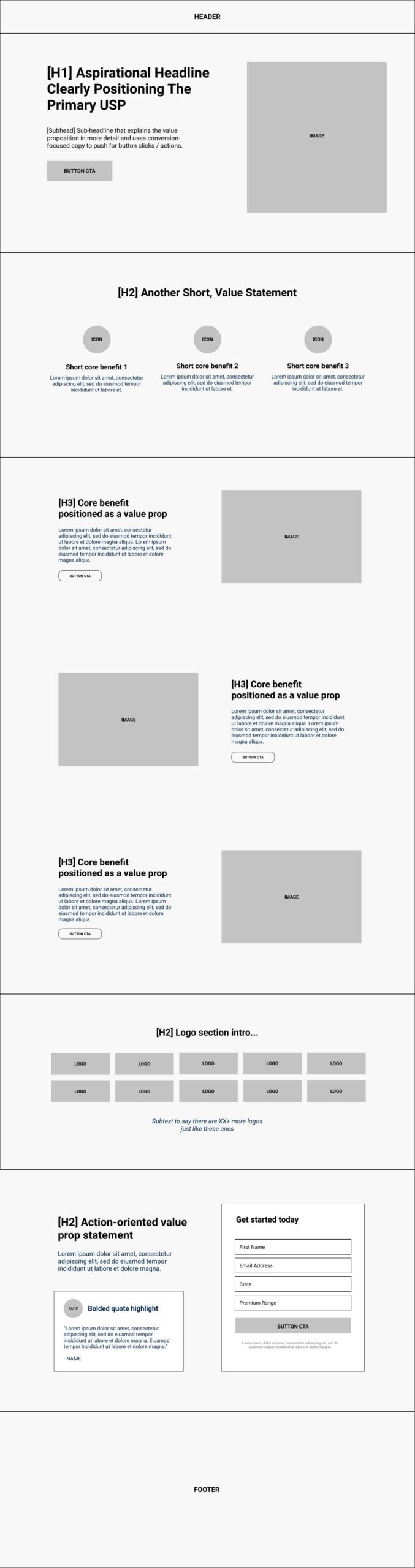
Structure is how your page is organized. It controls what users see first, what they do next, and how they move through your site. It answers questions like:- What is the first message on the page?
- Where does the user click next?
- What order does the content follow?
- How many steps to reach checkout or sign-up?
Core elements of structure
- Page hierarchy
- Section order
- Navigation flow
- Content grouping
- Call-to-action placement
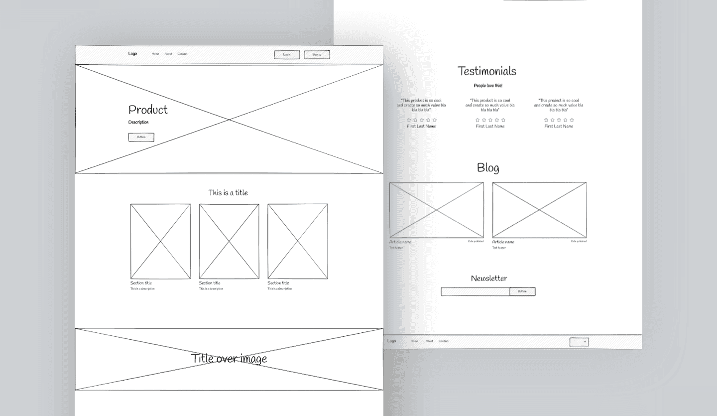
Example: E-learning website structure
If you are building a course site, your structure might look like this:- Clear headline with outcome
- Short intro video or summary
- Course breakdown
- Proof, testimonials
- Pricing options
- FAQ
- Checkout button
What Is Visual Design?
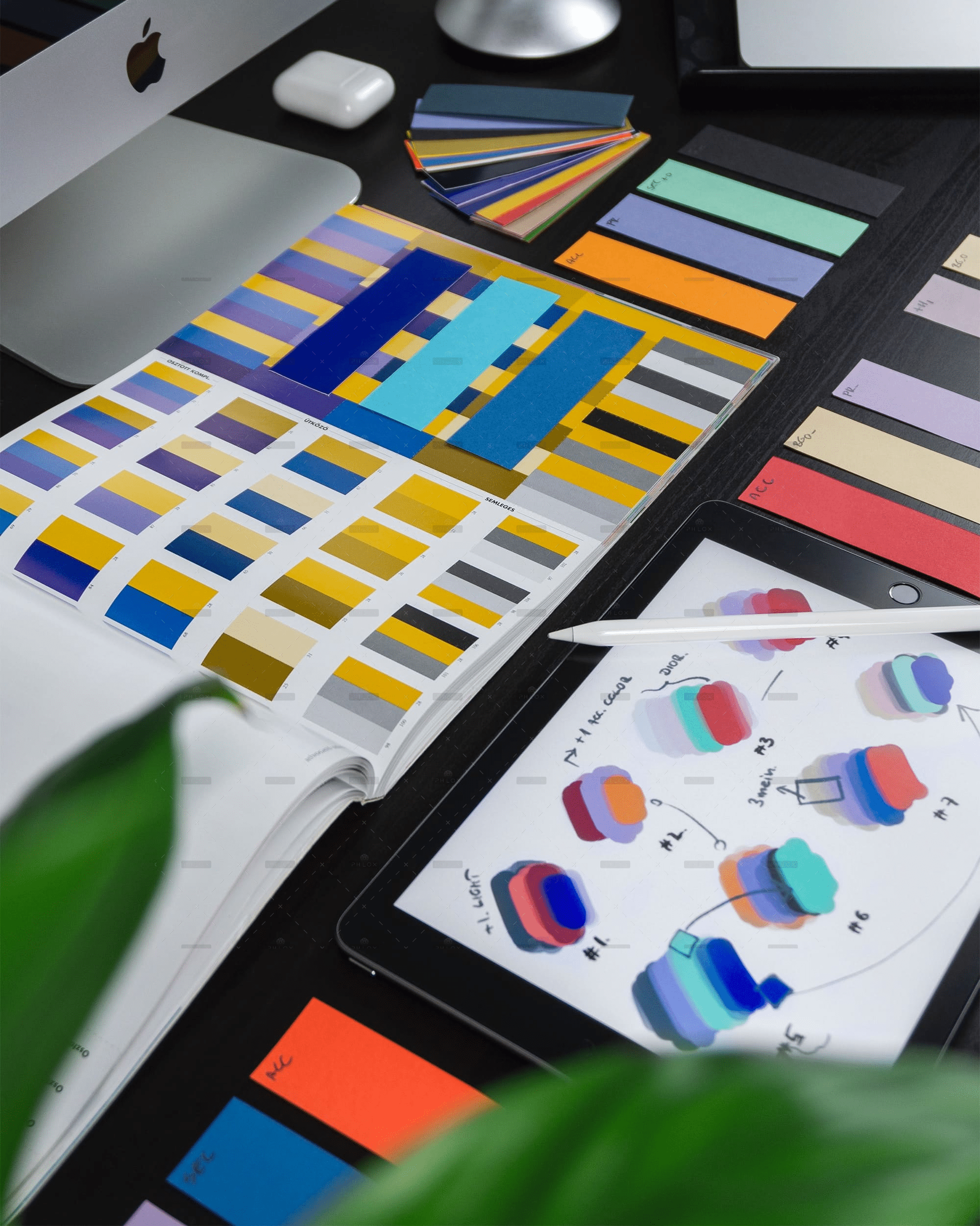
Visual design is how your site looks. It includes:- Colors
- Fonts
- Spacing
- Images
- Icons
- Style choices
Example: Visual design on a product page
-
Clean product images
-
Easy to read font
-
Clear contrast between text and background
-
Consistent button styles
Visual design builds trust. But it does not fix a broken flow.
This is what makes your brand feel polished and consistent.Example: Visual design on a product page
- Clean product images
- Easy to read font
- Clear contrast between text and background
- Consistent button styles
The Key Difference: Function vs Appearance
You can think of it like this:- Structure = how it works
- Visual design = how it looks
Why Structure Comes First
Most high-performing e-learning and e-commerce websites follow a clear structure. They guide users step by step.What happens when structure is wrong
- Users feel lost
- Important info is buried
- Too many choices create friction
- Drop-offs increase
Real example
An e-commerce product page with:- No clear product benefits at the top
- Price hidden below the fold
- Buy button hard to find
Why Visual Design Still Matters
Once your structure is solid, design improves results. It helps users:- Trust your brand
- Scan content faster
- Focus on key actions
Good visual design does this
- Uses contrast to highlight buttons
- Keeps spacing clean for readability
- Limits font styles to 2 or 3
- Uses consistent colors across pages
Structure vs Visual Design in E-Learning Websites
Strong structure for e-learning
- Clear course path
- Simple navigation
- Progress tracking
- Logical lesson order
Weak structure example
- Lessons scattered across pages
- No clear starting point
- Confusing dashboard
Visual design role in e-learning
- Makes lessons easier to read
- Keeps students engaged
- Reduces cognitive load
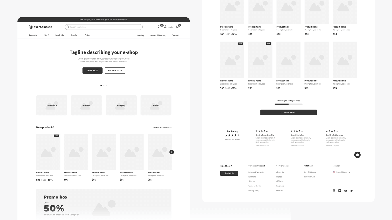
Structure vs Visual Design in E-Commerce
Strong e-commerce structure
- Clear category navigation
- Simple product pages
- Fast checkout flow
- Minimal steps to purchase
Weak structure example
- Too many menu options
- Confusing product variations
- Checkout with too many fields
Visual design role in e-commerce
- Highlights product images
- Builds trust with clean layout
- Improves readability of pricing and offers
How to Fix Structure First
Step-by-step process
- Map the user journey – Entry point to conversion
- Define one main goal per page
- Remove unnecessary sections
- Place your main CTA early and repeat it
- Group related content together
Quick audit checklist
- Can a user understand the page in 5 seconds?
- Is the next step obvious?
- Are there too many options?
- Is key info above the fold?
Then Improve Visual Design
Simple visual upgrades
- Use 1 primary color and 1 accent color
- Choose 1 heading font and 1 body font
- Increase spacing between sections
- Use consistent button styles
- Add high-quality images